In this case study, I do my best to condense 3 years of work on the Quickteller overhaul into a manageable read so bear with me. From its start in October 2021 till my watch ended in October 2024, I served as the lead designer overseeing a team of six through research, the design of the new mobile, web, and USSD apps, all the way to its closed beta release.
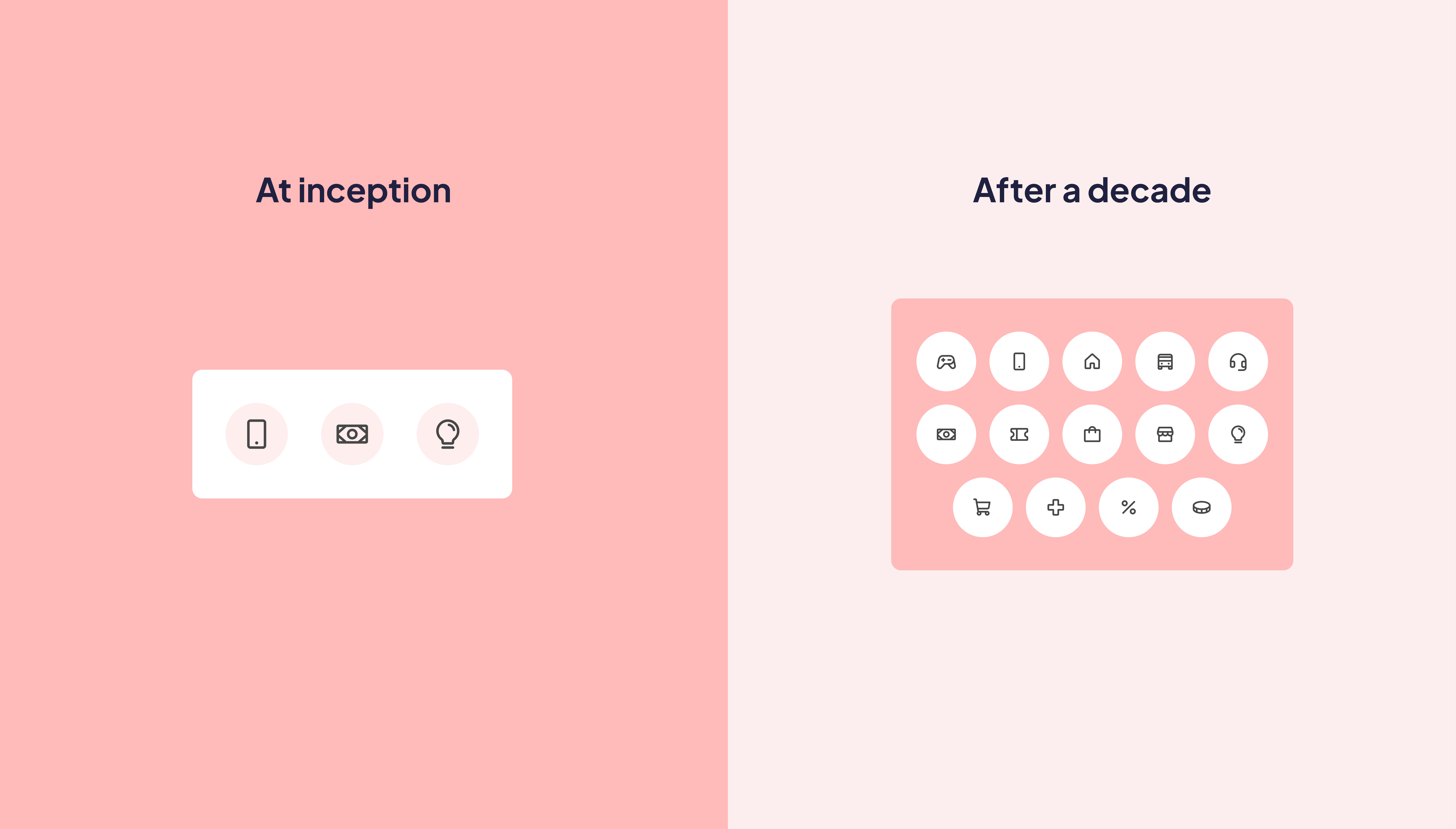
Quickteller started as a basic payment app but grew beyond that within a decade. As it grew, challenges caused by design inflexibility and a weak infrastructure made it difficult for us to expand unrestrained. We had only one recourse, rebuilding Quickteller from scratch.
For years it was obvious to the team and leadership that a ground-up overhaul was necessary and we finally got the greenlight. Before that could happen, there was a question to answer: What form should the new Quickteller take?
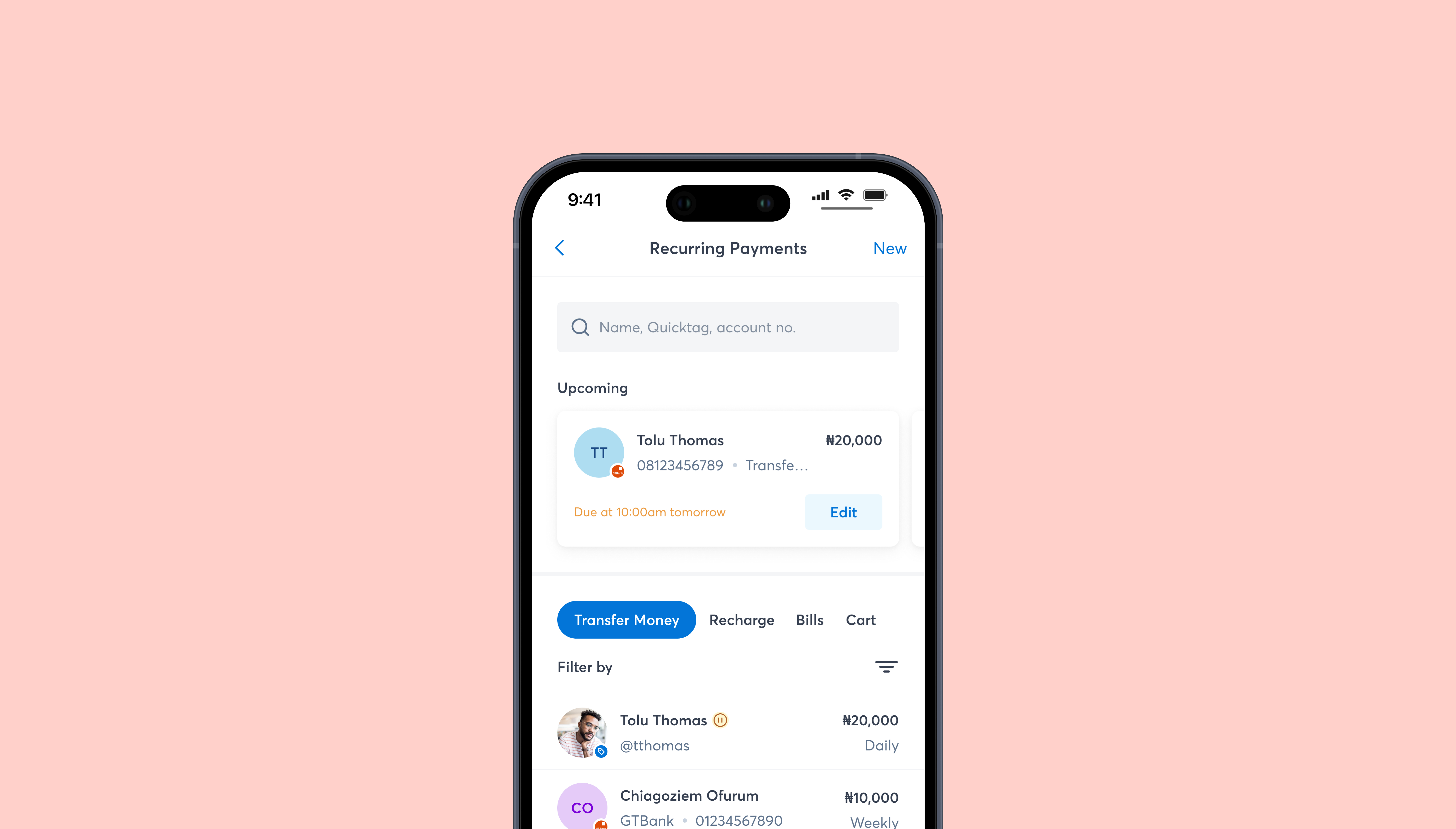
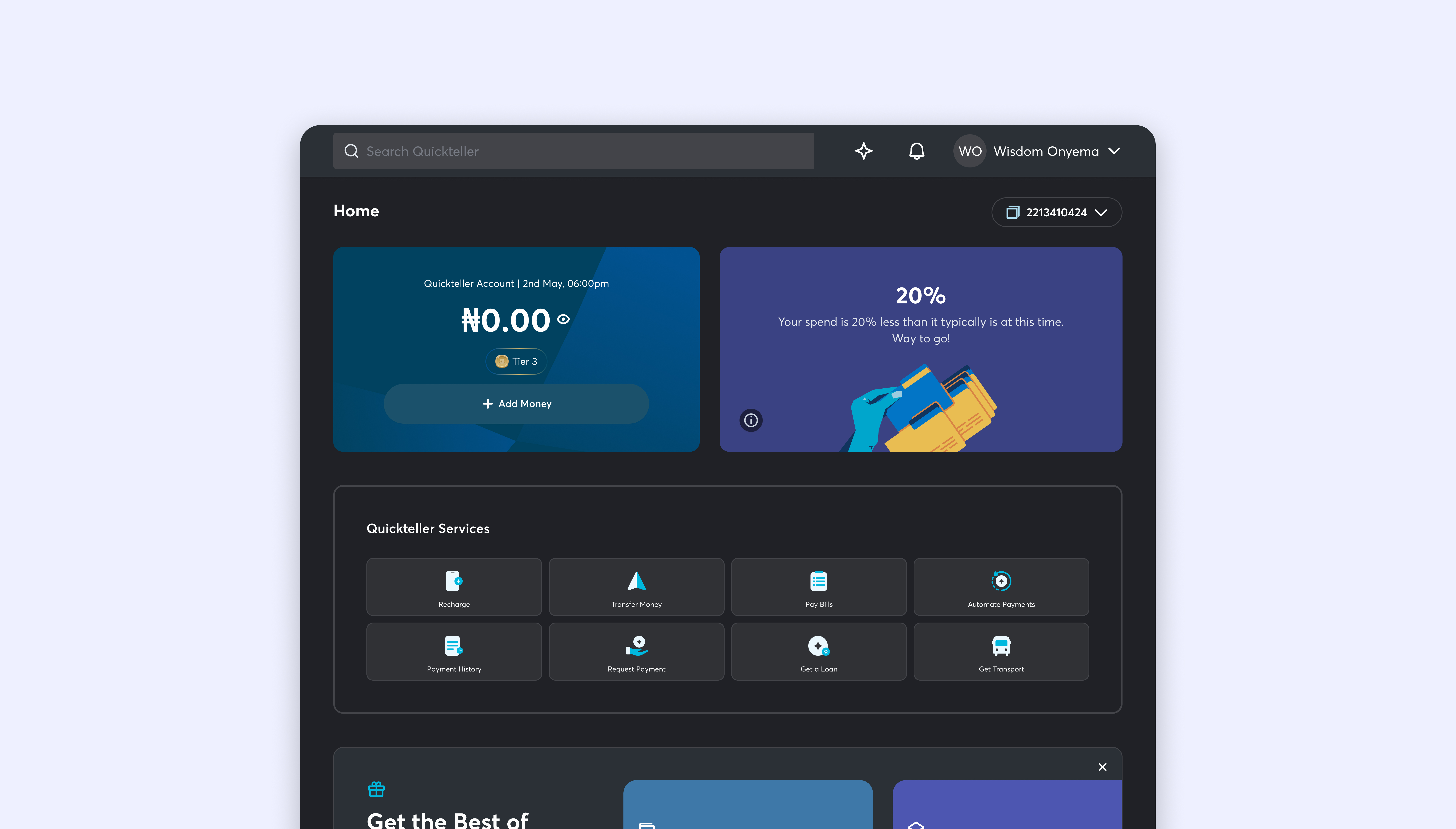
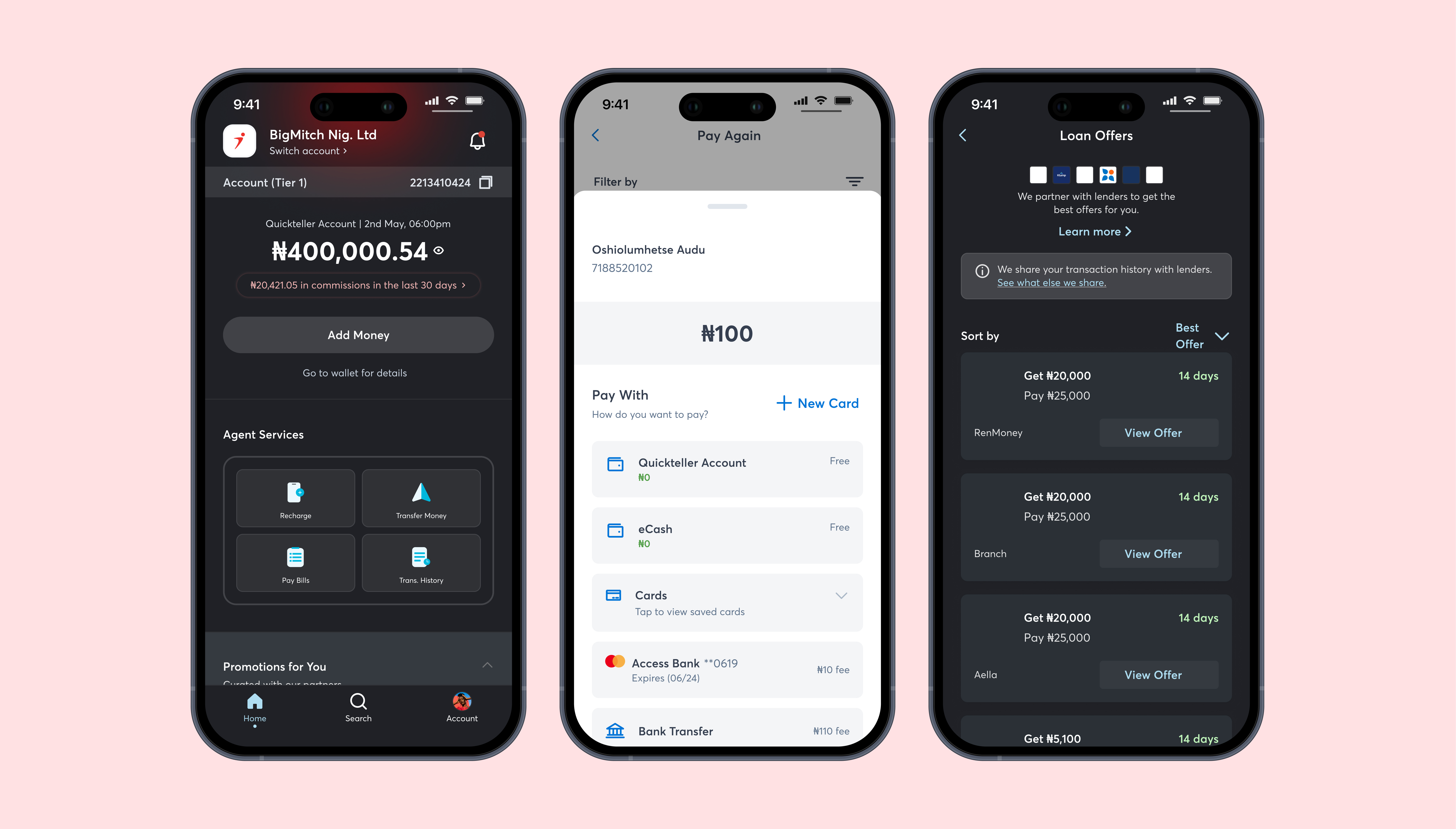
Due to its design inflexibility and weak infrastructure, Quickteller was disjointed. Some features/products existed separately because we couldn’t fit them in the mobile and web apps. Some existed only on the web app but as separate apps on mobile and when we could, we fit them in the mobile app.
We had to make a decision. Do we leave Quickteller products scattered about, do we harmonise them or was there another path? We decided to let research guide us. In 3 phases of research (generative, design sprints and evaluative), we uncovered our answer - we were going to build a Quickteller Superapp.
We wanted to understand how the current execution of Quickteller impacted the business and customers and to gain a deeper understanding of business goals and customer behaviour to help us uncover opportunities for solutions and innovation.
For the business a few considerations were stressed. Firstly, Quickteller was pivoting from strictly payments to a lifestyle product. Flexibility of the new version was paramount to avoid recreating current issues and with rumors of an IPO floating for years, valuation was also top of mind.
Due to the new lifestyle pivot, we sought to understand customer needs through that lens in addition to understanding their experience with the current product. Insights collected included their heavy reliance on mobile, that they currently cycle through multiple products to meet lifestyle needs and their preference for tailored experiences.
After synthesising the data gathered in the research phase, we mapped them to find common themes. These themes led to the 3 product concepts for the new Quickteller.
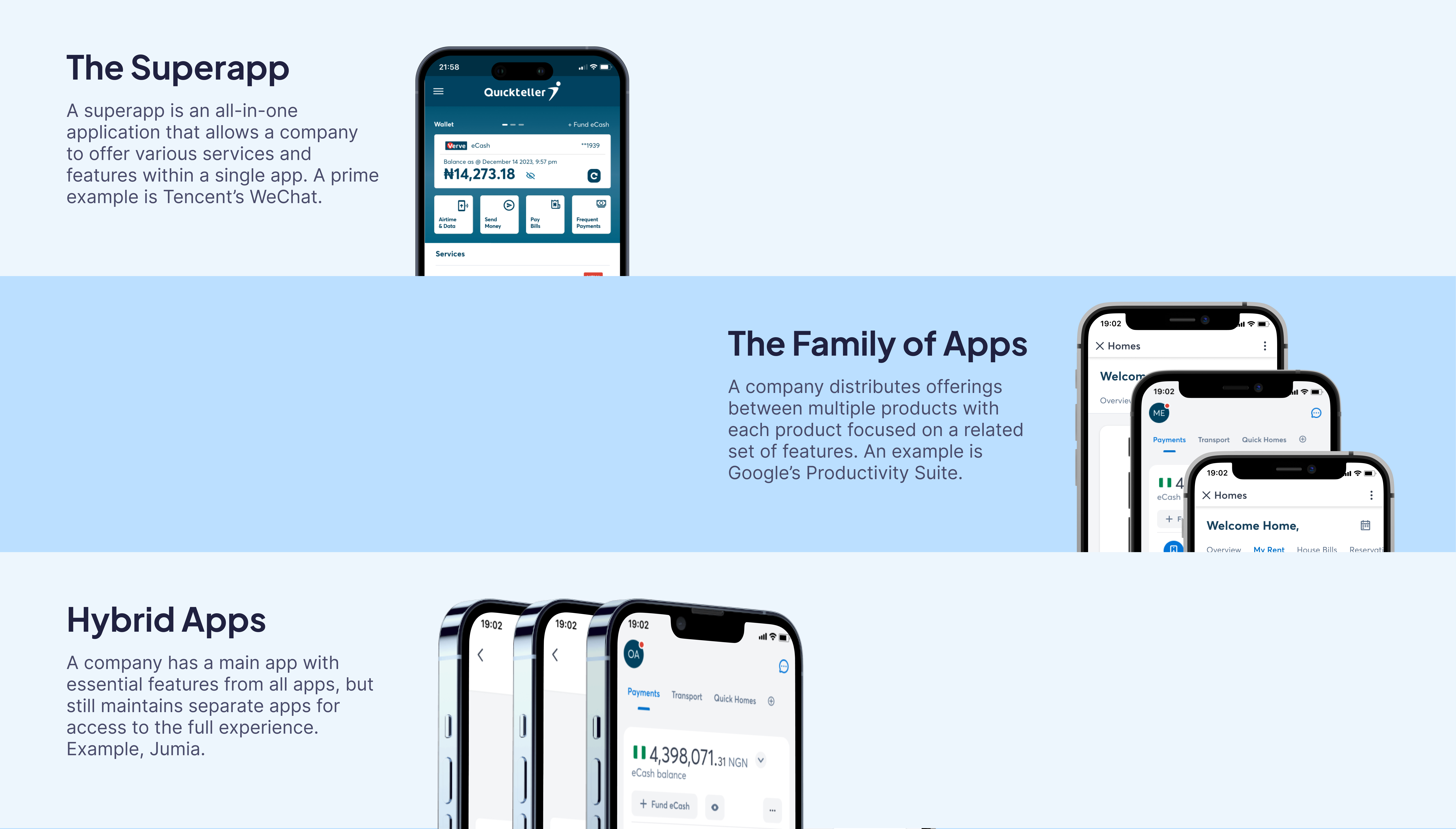
Now armed with three concepts for the new Quickteller app, we initially tried to determine what our pick should be through internal and customer surveys. The results came back inconclusive due to respondents not having a practical understanding of what the concepts meant.
To solve this, we decided to build models of each one. We leveraged design sprints to structure the creation of the apps, focusing on one model per sprint. We wanted to bring to life the complexities and ease that each app concept could present so that our testing was as accurate as possible. The collaborative nature of design sprints involving cross-functional teams helped us get close. We selected identical flows to design and test for each app because uniformity was the key to ensuring tests were not skewed.
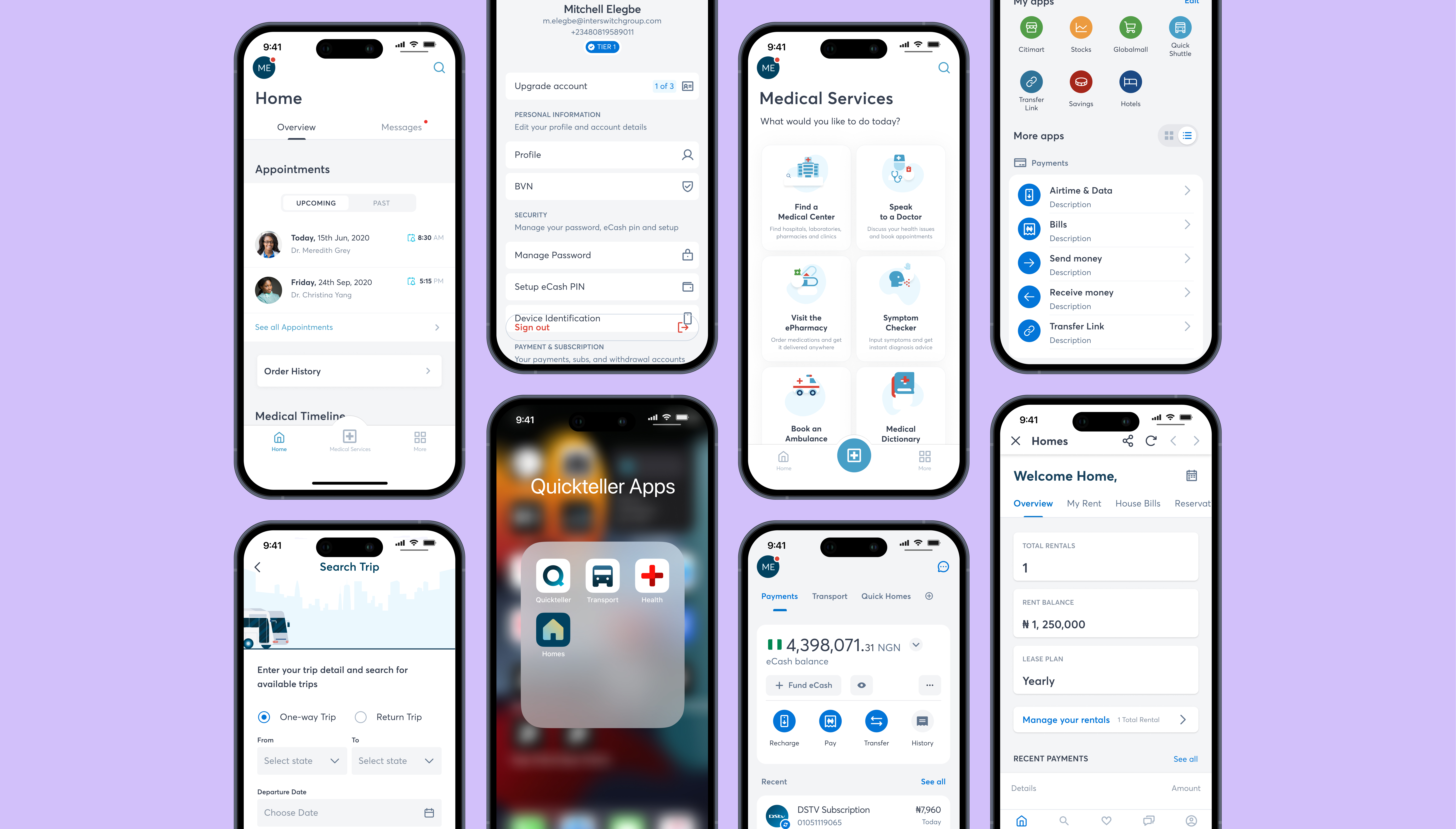
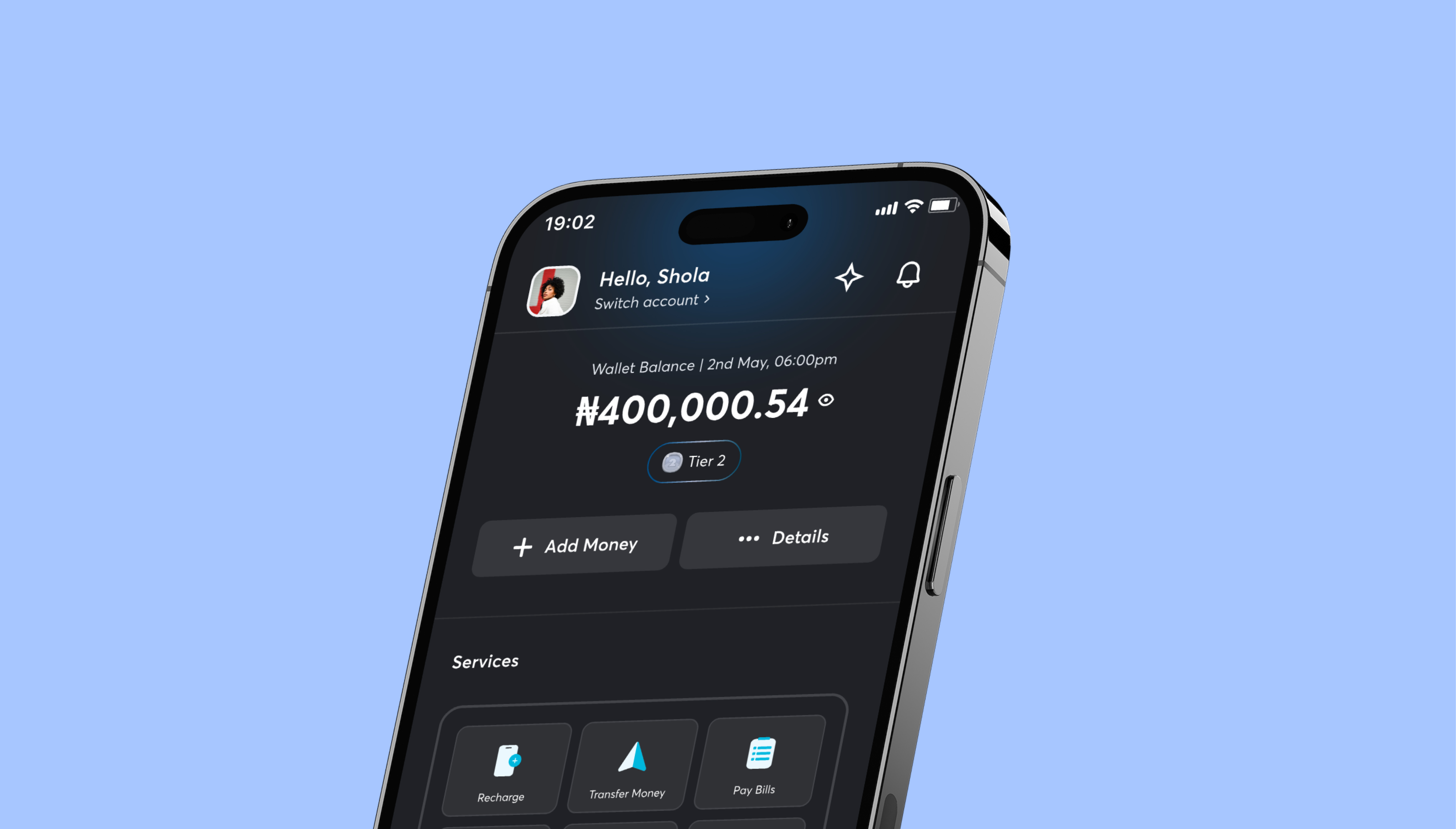
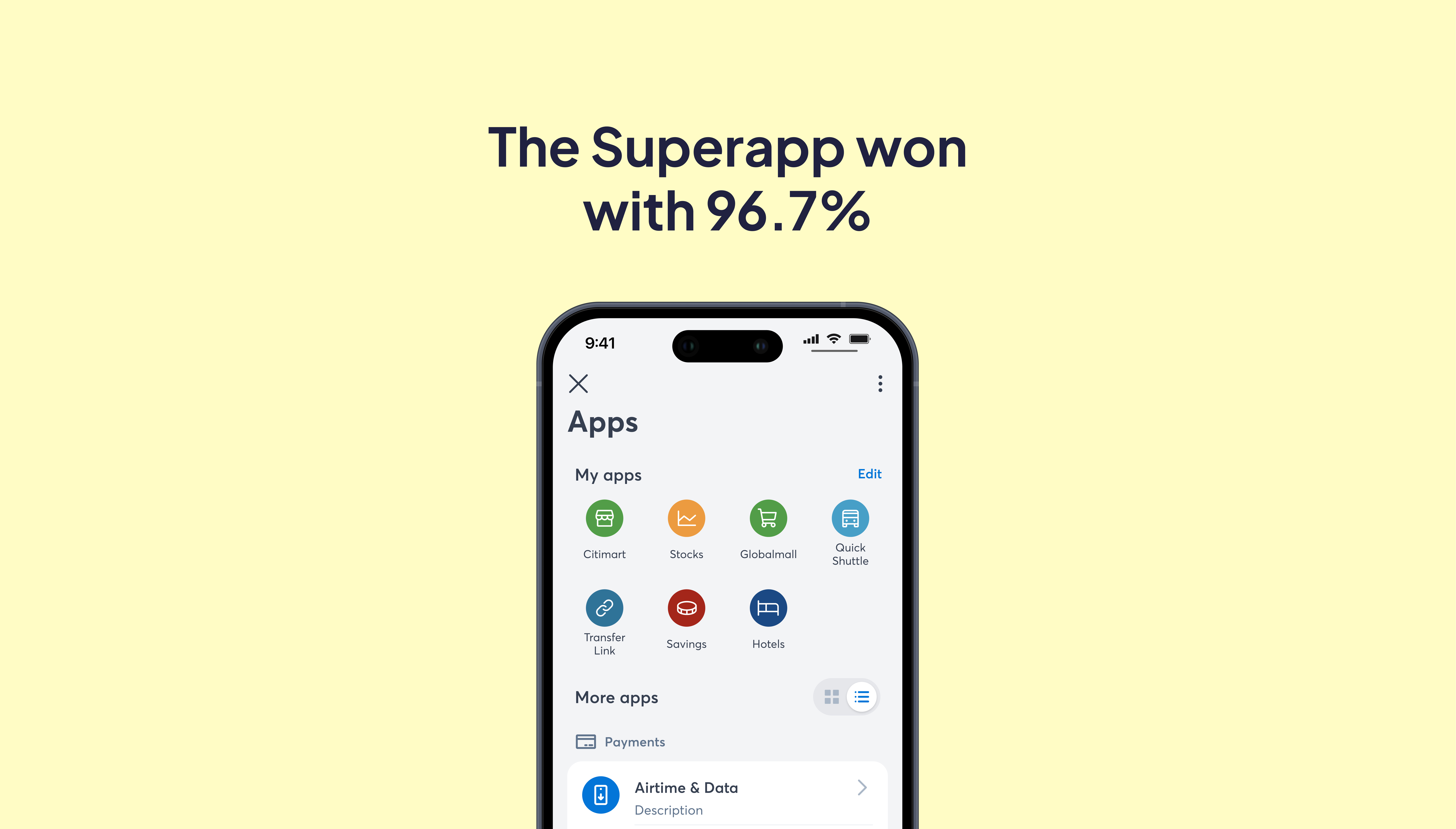
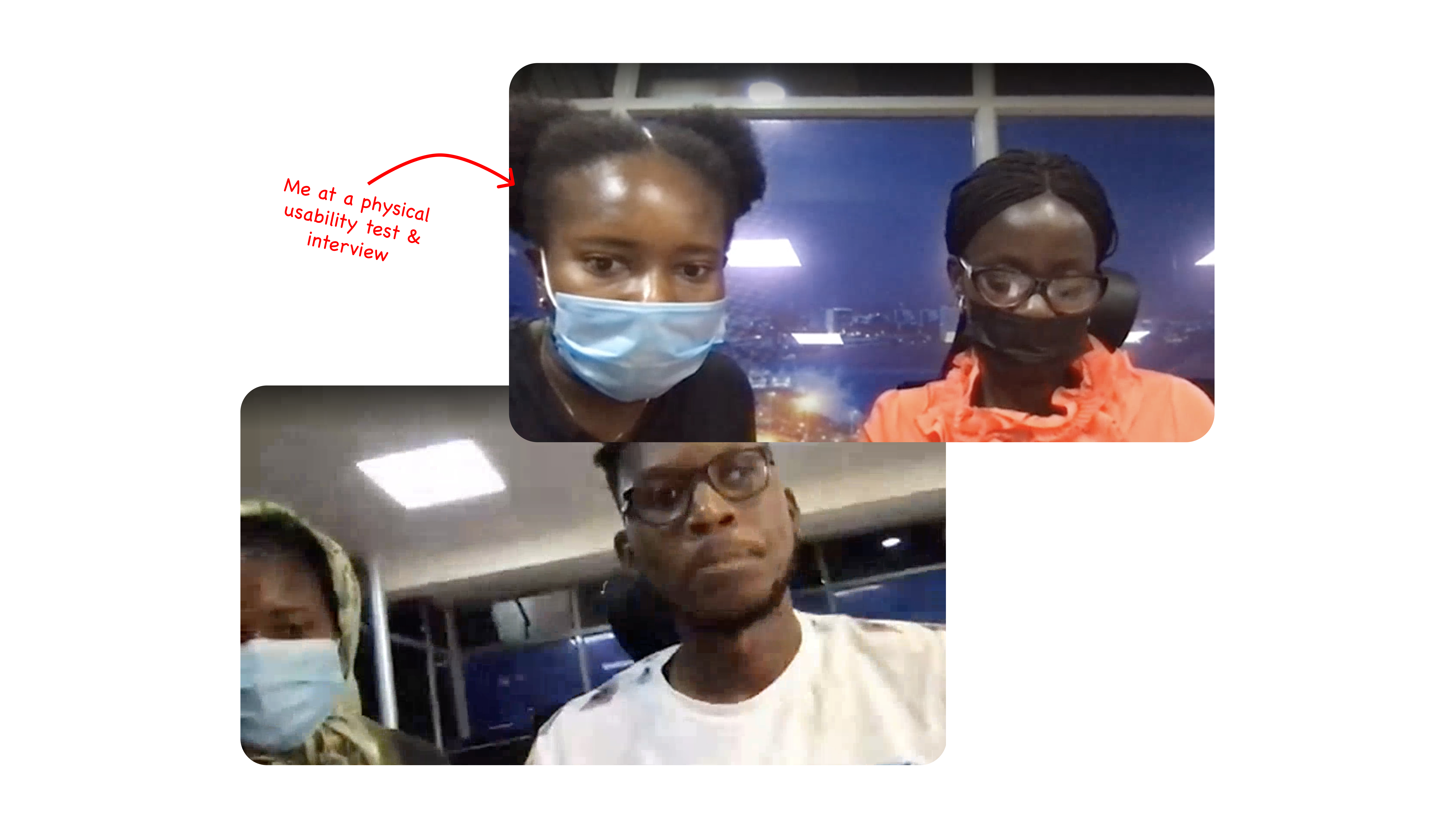
With the models from the sprints, we conducted usability tests and interviews with 30 participants (63.3% current users & 36.7% non-users). The tests took place over 6 days and were both remote and physical.
At the end of the tests, the superapp won by a large margin of 96.7% with brand trust, ease of use, device storage being key deciding factors. We had our answer, the new Quickteller was to be built as a superapp and we could progress to stage 2 - designing the new Quickteller Superapp
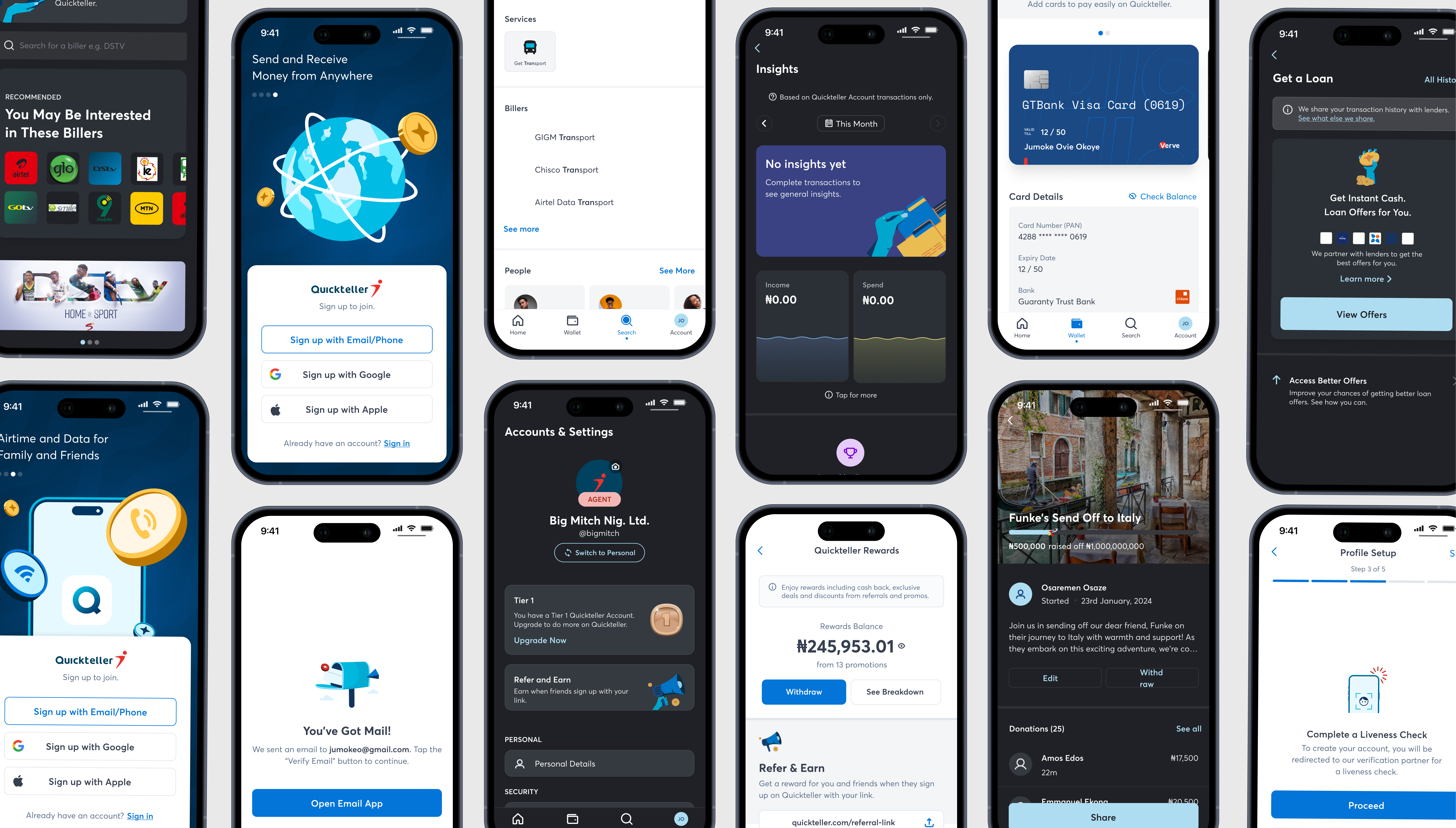
As the lead designer, I managed the end-to-end design from planning to strategy, execution and delivery. This included establishing a systematic design approach, laying high-level design foundations, setting guidelines, reviewing work, managing stakeholders and designing hands-on etc.
Using insights gathered from the research stage, I set principles that guided the team through the design of multiple modules
Create a foundation that could adapt and evolve to meet new challenges, technologies, and user expectations.
Feedback from testing consistently highlighted a lack of customer trust in the Quickteller brand. With the rebirth, we could build trust again.
In testing, storage size significantly influenced choice. The old app also had bloat that caused challenges. Keeping the new app lightweight was key to success.
Ensuring a simple and consistent user experience/interface design with a superapp is vital to reduce cognitive load.
It was imperative that the superapp was tailored to align with specific customer lifestyle choices and interests.
Recurring Payments allows users to set up automatic scheduled payments. Designed for convenience, it removes the need for manual payments, making it easier for people to manage regular expenses like subscriptions or utility bills.
To establish goals for the updated Recurring feature, I conducted research to understand product and customer challenges. Analysis using Microsoft Clarity revealed significant issues: only 0.17% of total Quickteller sessions included visits to the Recurring module, with 10.3% resulting in form submissions. Session recordings indicated that many visits were errors, with approximately 70% of visitors exiting quickly (data from a 3 month period).
Total Quickteller sessions
Recurring sessions
Smart events in Recurring
Avg. time spent
After exploring numerous potential causes with a Root Cause Analysis, our user survey and guerrilla interviews revealed that our adoption problem was caused by low awareness. Many customers were not aware of the Recurring feature and location, labelling and inadequate marketing were listed as primary reasons.
We now had a clear priority - to increase adoption. Our target was conservative influenced by low brand trust and users' skepticism of automated payments. We aimed for 1% adoption within 12 months.
There are four parts of the feature adoption funnel - Exposed, Activated, Used & Used Again. The design strategy was informed by all four parts to ease adoption in every area.
Exposed: When users find out that a feature exists.
Activated: When users experience the Aha! moment and understand the feature value.
Used: When users engage with the feature for the first time – once.
Used again: When users return to the feature and start using it regularly.
There are four parts of the feature adoption funnel - Exposed, Activated, Used & Used Again. The design strategy was informed by all four parts to ease adoption in every area.
Leveraged multiple in-app announcement styles to introduce the feature to ensure awareness.
Recurring was isolated from connected features. We integrated Recurring with them to emphasise their connection and to boost visibility as they were the most visited on Quickteller.
While announcing the feature, we ensured to also communicate the value of recurring payments aiming to shorten the journey from exposed to used.
We used a tour to ease learnability and usability for customers guiding them through the brief process of setting up their first recurring payment.
The flow for creating a recurring payment was designed to be simple, allowing the customer to do it all in two steps.
While designing, I remianed aware of issues that customers had with Quickteller eg. low brand trust. Wwe ensured that this feature provided reassurance, feedback, updates, thereby creating satisfaction and increasing brand trust.
Lastly, I set up success indicators to monitor that would help us measure the effectiveness of the design after launch. Working with the Data Team, we outlined metrics to monitor that we could not track using Microsoft Clarity alone. Major focus was on monitoring conversion through the feature adoption funnel.
Instead of the standard formula for measuring adoption ([feature MAU / monthly logins] * 100) which isn't suitable for this type of feature, we opted to base adoption on visits.
No. of recurring payments that existed before launch vs number that exists after launch, calculated monthly.
Measure effectiveness of discoverability campaign. (No. of total QT visitors / no. of interactions with discoverability assets).
Total no. of first time recurring payments created per user. Calculated monthly.
Total no. of repeat recurring payments created. Calculated monthly.
Revenue generated from recurring payments. Calculated monthly.
I left the Quickteller team just after its closed beta release. As a result, I was unable to monitor the impact of our improvements on Quickteller. However, this remains one of the most pivotal projects of my professional career. I learnt a lot about design, advocating for customers, the power of research, managing a team (and myself, really) through a large scale project, managing product managers (6 at once!) and other stakeholders, navigating challenges that I previously thought would be a lot to navigate, and lots lots more. I hope that we were able to achieve the goals that we set for Quickteller and for ourselves.
I worked closely with a bunch of people during this project. In the research stage, Kene Nwafor (Design), Ayobami Adelugba (Research), Tolu Thomas (Software Engineering), Tayo Winkunle (Product Management) and in the design stage, Wisdom Onyema, Ese Ughulu, Tomi Joshua, Jennifer Daniel, Ridwan Oladimeji (all on design), Twyla Idigbe, Ayokunbi Akande, Nnenna Okoronkwo, Rita Nicholas and Ebuka Ike-Mgbechi (all on Product Management) and Tolulope Thomas, the lead engineer.