A proprietary authenticator helping banks to offer stronger product security to customers
About the Interswitch Authenticator
Nigerian financial institutions prefer proprietary authenticators for transaction security over widely available ones. I designed a white-labelled authenticator that enabled these financial institutions to provide two-layer security to their customers, and an admin side product that allowed the institutions and Interswitch to manage their respective customers.
I was the sole designer on this project handling research, product design and collaborating with product management, engineering and business development.
- Design Strategy
- UI/UX Design
- B2B
- B2B2C
- Security
- Mobile
- Mobile
Shaping the strategy around our customers
Although the end consumers of this product were customers of financial institutions, our primary customers were the financial institutions that acquired the product and adopted it for their security needs. As a result, our business goals, which a portion of our design strategy was shaped around, were to:
- Secure first sales
- Drive initial adoption
Securing first sales & driving initial adoption
To support the business, product and sales teams in achieving these goals, we developed the following strategies to guide design.
- Design for easy adoption (Financial Institutions): To make the adoption of the authenticator easier for financial institutions, we provided design guides for how the authenticator app could be adopted within the financial institution’s banking platforms

- Design for easy adoption (End Customers): Our solution had to cater well to the wide range of most financial institution’s customers
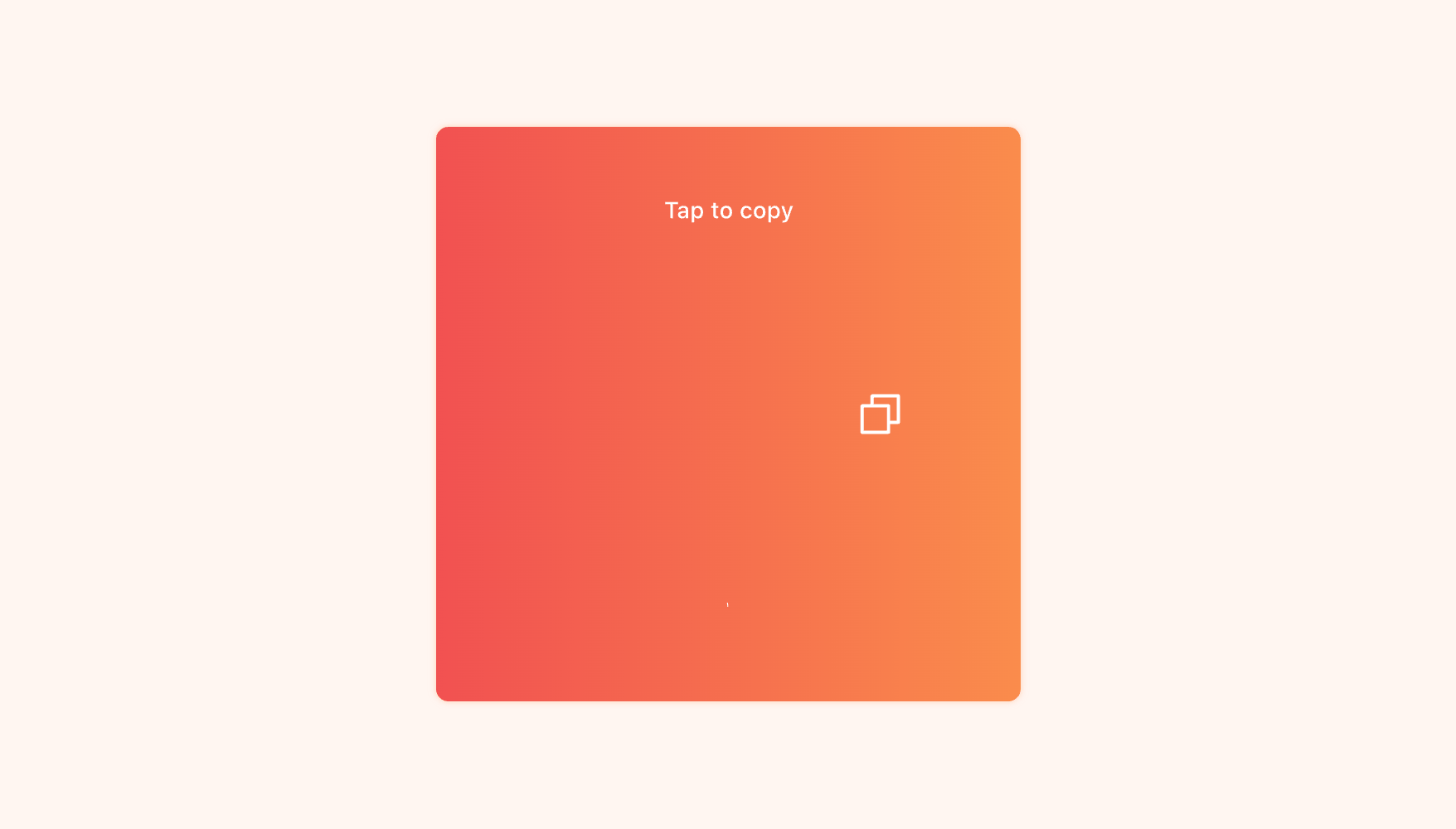
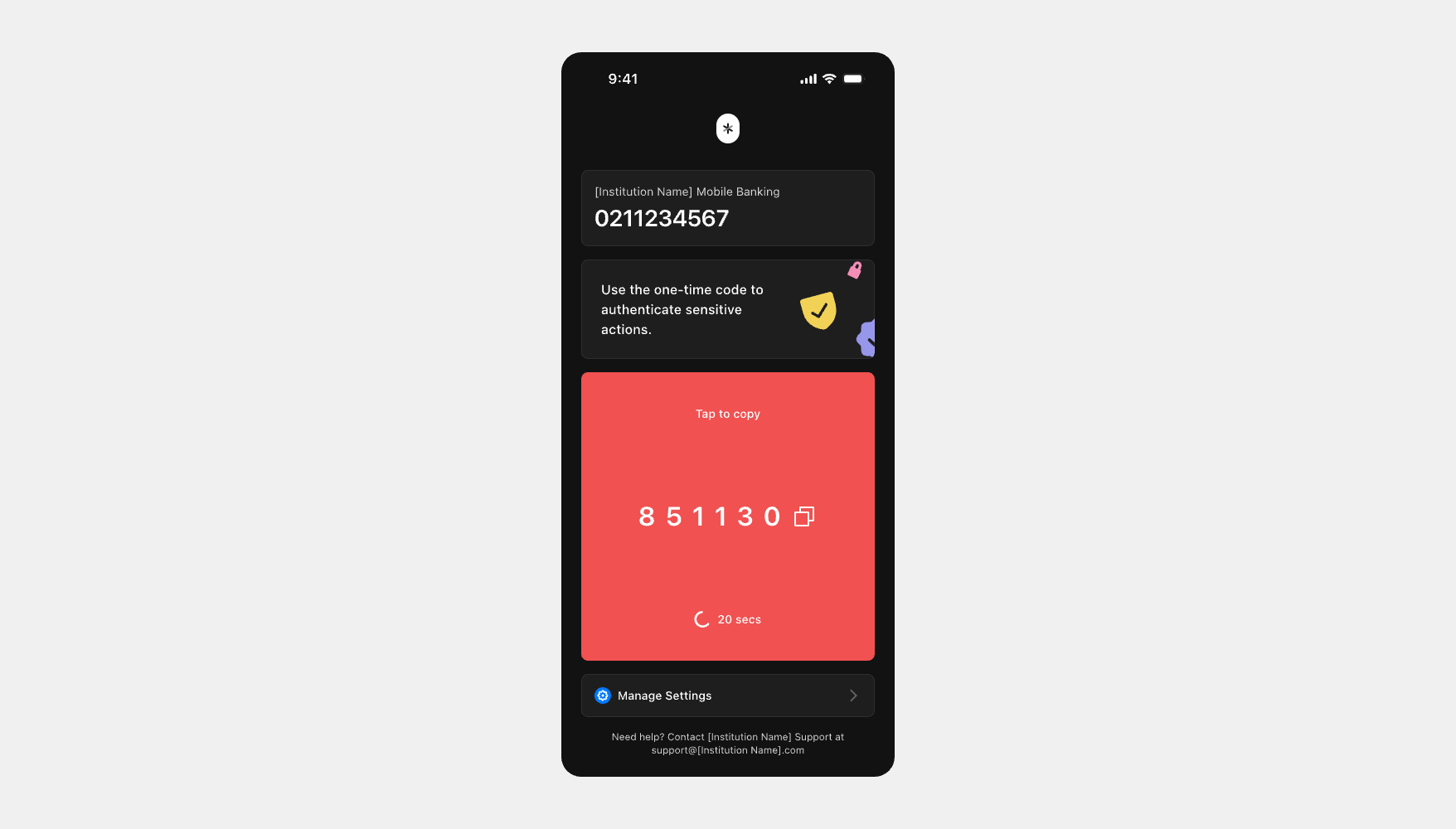
- UX Design: Given the broad target audience on many levels including age, tech-savyness etc., the LCD (Lowest Common Denominator) principle was adopted to ensure accessibility and usability for everyone. Designs featured similar flows and design patterns established across popular authentication apps
- UI Design: The design leveraged OS native components for recognition and familiarity which in turn, would aid ease of use

- Design for client-centric visualisation: We created mockups of the product with customer's branding to aid the business/sales teams when pitching the product to potential buyers. This helped customers envision the product as their own.
- Scalable customisation: We offered potential customers some individuality to assuage the worries about market uniformity that typically come with white-labelled products. We designed multiple options for select app pages.mers envision the product as their own.

The admin app
After the developement of the consumer app, we created an admin side product that allowed the financial institutions to manage their customers, and that allowed Interswitch to manage the financial institutions.